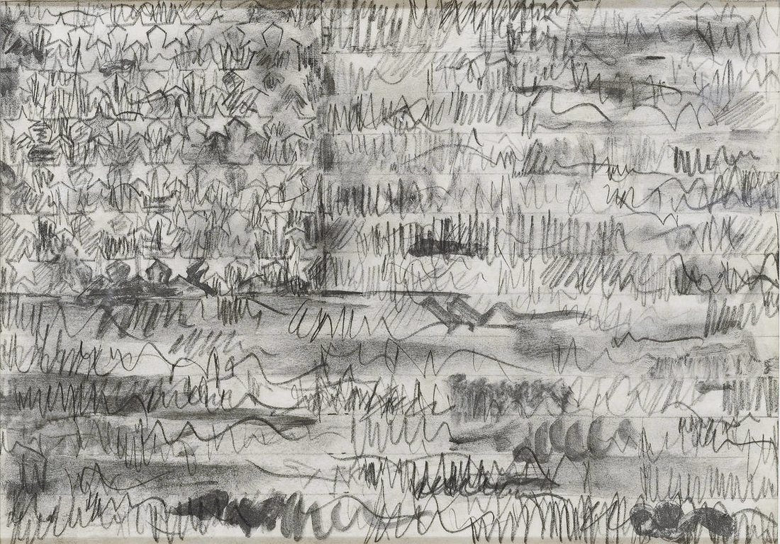
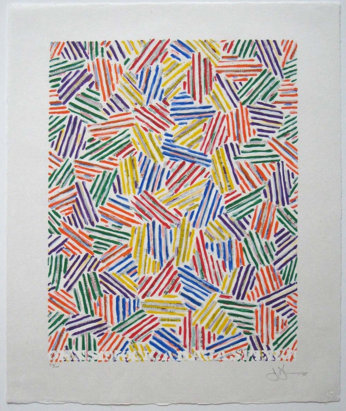
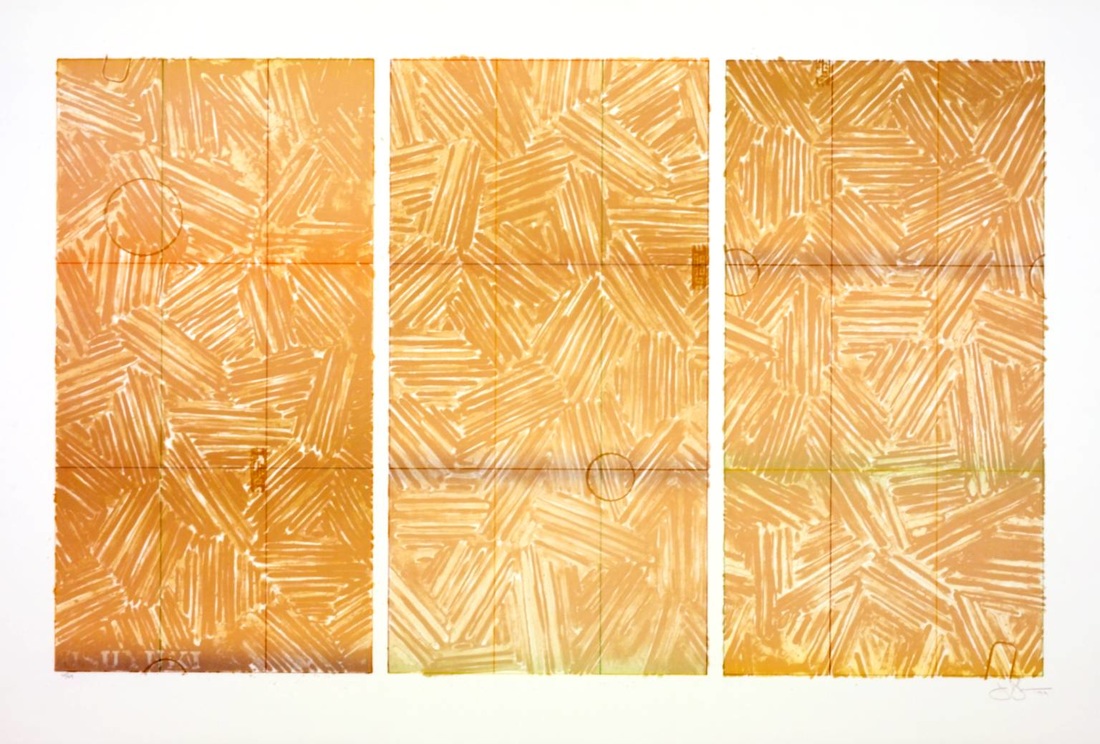
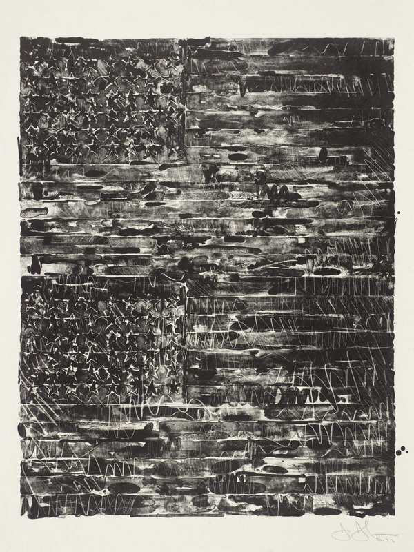
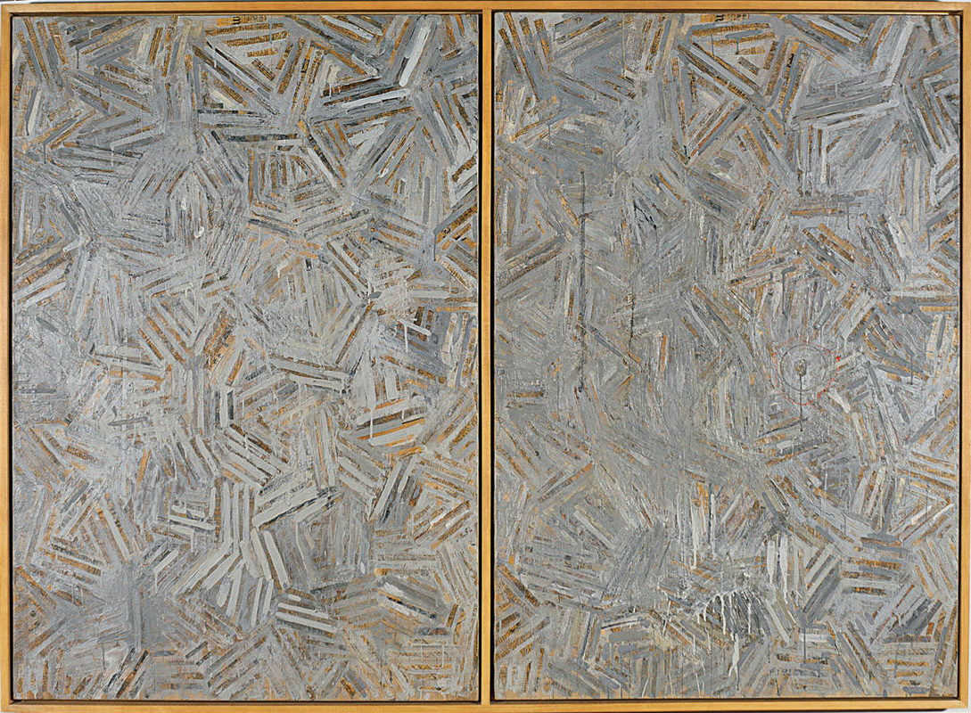
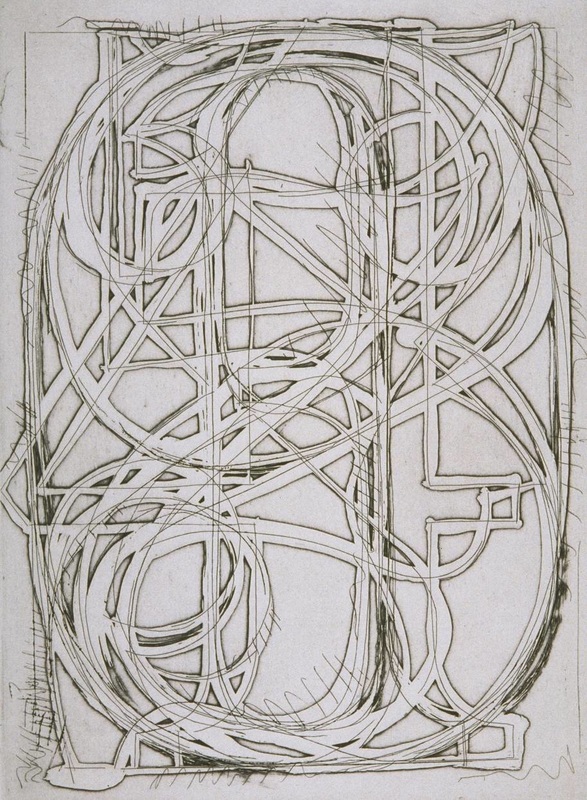
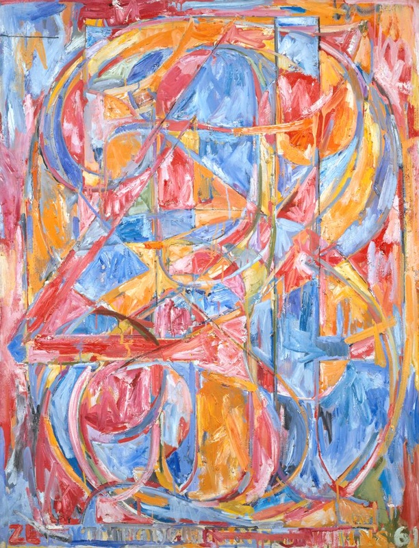
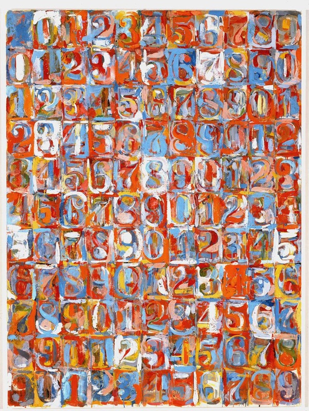
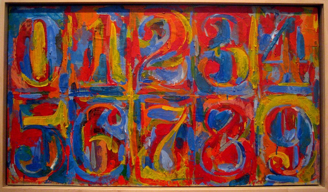
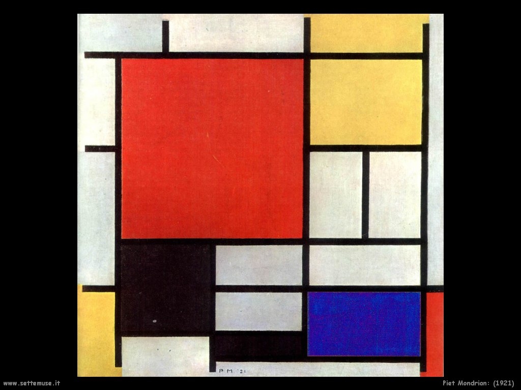
Jasper Johns is one of the most accomplished, and similarly debated artists of the 20th century. Adhering to a strict set of motifs for a career that has spanned over 50 years, Johns combines texture, color, and line to create compositions that are inspired by known images, the most famous of which being flags, maps, and numbers. Johns worked in an era before Pop Art, but after Abstract Expressionism (we generally refer to this movement as Neo-Dada). Looking at his various works shown to the right, I would like you to compare and contrast Johns' work to that of Abstract Expressionist Jackson Pollock and De Stijl front man Piet Mondrian in the comments section below. Are there any similarities? How are they different? Please use proper grammar, vocabulary, and full sentences. A good response to this kind of comparison should be no less than two paragraphs. You will also need to respond to one of your classmates' posts to recieve full credit. | |
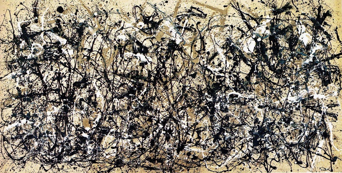
9/14/2015 11:11:16 am
Discussion Forum: Pollock v. Johns v. Mondrian
Honoka Imai
9/19/2015 09:30:35 pm
Do you think Johns is the best artist?
Marie Heuberger
9/20/2015 04:43:03 pm
What you have said about layering is very interesting, and I agree completely.
Paige Rickman
9/19/2015 10:13:04 am
I think that the Three artists differences are they both have completely different types of art work. Johns is very detailed but it looks messy. Pollocks looks like he can just splatter the paint brush all over a paper and make it look interesting. Then Mondrian is very precise and clean. 9/19/2015 08:44:10 pm
A very acurate and simplified description of the artists! It got me thinking about how much talent one has to have to make a piece look messy but also look like it was done by a professional and not a elementry school kid... very impressive indeed.
Brandon Piete
9/20/2015 02:00:43 am
Very well description of these three artists. I agree with everything you have to say about the similarities and differences of these artists. It is fascinating that someone like Johns can make something so messy but also make sure you can see the numbers and details.
Hima
9/19/2015 12:36:36 pm
If there is Jasper Jaws of work also guy who understands the numbers clearly, there work the numbers do not know at all.
Honoka Imai
9/19/2015 09:22:55 pm
These three artists have similar and different characteristics. Pollock and Johns both have art that is layered and colors blended. Johns and Mondrian both have art that is planned and precise. All three artists have colorful art.
Brandon Piete
9/20/2015 01:54:07 am
These three artist have different styles of art. Despite their differences Pollock, Mondrian, and Johns have some similarities. Mondrian and Johns both display color on their portraits. Pollock and Johns also share some similarities, one of them is that the portrait is messy and there is overlapping.
Gibson
9/20/2015 12:41:38 pm
I think that was very well put. I agree with all your points. Very well said Brandon.
Casey Humphreys
9/20/2015 07:36:47 pm
I like how you talked about all of them and how some of there drawings overlapped and how some didn't. What the portraits looked like why he drew them.
Gibson
9/20/2015 12:38:52 pm
It is very fascinating to look at the different type of styles from each artist. Piet Mondrian is all about percision. Almost all of Mondrian's lines are perfect and straight, while Jackson Pollock seems to almost scribble his lines on the page. Then finally you have Jasper John who is a mix of both. John uses both curved and straight lines with his art.
Marie Heuberger
9/20/2015 04:38:43 pm
It is very interesting to have to compare these three artists, although there is something that seems similar in all of their works. The very strong lines of juxtaposition seen in John's and Mondrian's work, along with coloring inside these lines are reminiscent of each other, but Pollock seems to have a different style.
The first aspect I noticed was the use of line. Pollock and Mondrian contrast a lot in this area. Pollock would drizzle layers of paint, creating organic and static lines. His work comes across as flowing and moving, with no specified focal point. Mondrian's work was very controlled and geometric. The size of the shapes, as well as color, offer more of a guide as to where to focus your eyes. Judging from what I can tell on a screen, Mondrian's work was relatively flat. Pollock's work was very textural with many layers of paint.
Disgrace
9/20/2015 11:14:15 pm
I meant dynamic, not static.
Casey Humphreys
9/20/2015 07:34:30 pm
I think it is very interesting to look at the two artists and see what they see in the painting and how they draw the image. Johns work is very messy and sometimes hard to see, but you can still see the numbers. I feel Pollock and John have more similarities. Because there paintings are both messy.
Stephen
9/20/2015 08:45:36 pm
Johns is almost a bridge between the two (Pollock and Mondrian.) Pollock, obviously, uses a very erratic form that reminds me of a project my class did freshmen year. Mondrian used fairly generic shapes and colors that aren't very relatable. Johns used familiar and relatable shapes in a very sloppy way, but not randomly. It's a systematic mess that we can interpret more easily than Pollock or Mondrian because it uses chaos in an orderly way Comments are closed.
|
Please Note:This is where you will be graded for your participation in discussion forums. Comments will be locked at 10 pm the night they're due. Archives
April 2018
Categories |